Following a testing year for almost everyone the launch of a smart new website for us is a strong statement of our identity, approach, and commitment to thrive in the new business landscape. The website showcases the breadth of expertise JT & Sons has in specialist relocations from a range of industrial and commercial clients, such as gyms, factories, and online retailers. That combined with our eco-friendly credentials has left us well-placed to emerge from a challenging year with an exciting offering for the future.
In working with the web design company, we explained that we wanted the graphics to convey our modern approach to moves, many of which are in more traditional industrial environments such as factories. This is exemplified in the background of the website’s landing page; an elegant depiction of the London skyline that places the modern and the traditional side by side.
With the website user journeys agreed and the design, content and build well under way one thing became glaringly obvious to a number of those involved in the project. Our logo looked out of place and a little dated.
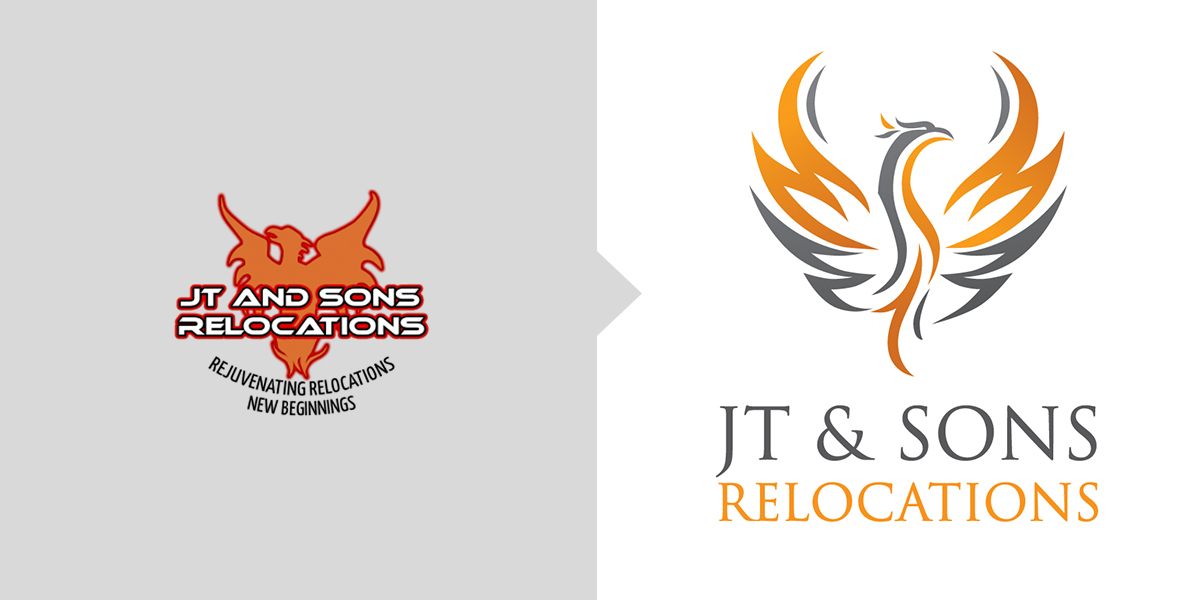
Created when Timon and I set up the company in 2008, the logo – a stylised Phoenix – holds a great deal of meaning for us. Having experienced difficult times prior to setting up JT & Sons Relocations it signified a fresh start for us and, as the mythical Phoenix does– it represented something rising, renewed from the ashes of the old. Because of this we were very reticent to have it messed with and certainly didn’t want to lose it – not least as it was by then on all our stationery, marketing materials and corporate workwear! Jo and Steve at our appointed design company Rubicon were very keen for us to change the logo to better marry with the fresh, new website and, having spent some weeks wearing us down, when they offered to rebrand it for free we agreed to take the plunge!
We love the new logo. It’s retained everything we wanted it to and, kept what we liked about the original but at the same time is more elegant and sophisticated. It retains our corporate colours; the company name is far easier to read and it’s now far more recognisably a Phoenix. 2020 has been a year that has been difficult if not catastrophic for many companies so we’re thankful that at JT & Sons due to good planning and adapting to changing situations we’re no longer just rising but now feel like we’re soaring!


Leave A Comment
You must be logged in to post a comment.